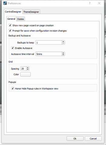
Select File>Preferences. The Preferences dialog displays for ControlDesigner application settings. Two tabs are displayed, splitting the preferences for ControlDesigner and ThemeDesigner.
The ControlDesigner tab is split into two tabs, General and States.
ControlDesigner provides backup and autosave features for user convenience.
Note: The number of backups specified will be kept at all times. Backup files are created with the same project name and appended with ",*revision if specified*_bak_currentdate_currenttime.lcdconf" (for example "My LCD Configuration, A_ bak_2021-05-21_11-32-.lcdconf"). Manual save actions overwrite the oldest backup file when the user specified limit has been exceeded. A manual save also removes the autosave file until there has been unsaved edits for the specified time interval.
Popups shown in a Page workspace can be set to honor hide rules while programming. For example, Hide on Overlap, or Hide Other Popups. By default, this setting is enabled.
A control is created with states that are designed with elements such as text, skin, and color within in the created theme. Default states cannot be edited however you may add or edit other custom states as needed.
Note: States specified in this preference dialog will be created for each new instance of a control type and will apply to any open configuration in ControlDesigner.
Using the States preferences you can specify custom states intended for use with a selected control. In addition to specifying custom states, you can also specify the elements for the state that you want included with the control as it is pasted or added into a configuration.
CAUTION: Use caution when creating and assigning custom states to controls. Each new state name created must also be present in the theme the configuration uses. Alternatively, the control's new state will require manual programming of the related properties within LightDesigner. This manual method requires additional and unnecessary work later as each instance of the control in the LightDesigner configuration will require manual programming.
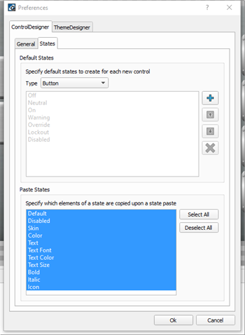
When a theme skin uses a control that includes the same matching custom state name, that state will automatically be selected for use.
 button. The New State will be added to the bottom of the list.
Note: Custom states specified here will be created for each new instance of the control type, and will apply to any open configuration in ControlDesigner.
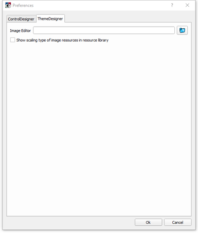
ThemeDesigner preferences are available to select an image editor (external image editing software) that will be used by default when opening an image for edit within the application.
 to display the "Select an image editor" dialog.
In addition, the "Show scaling type of image resources in resource library" check box is provided.
Select the "Show scaling type of image resources in the resource library" check box to display a scaling label for each of the image resources in the ThemeDesigner resource library as it is opened. Scaling types include stretch, zoom, and scale.
