Basic Properties
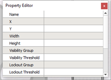
A basic set of properties are displayed in the Property Editor for each control, regardless of the type.

- Name - the control's name helps identify it throughout the application. A unique name that identifies its use is strongly encouraged (maximum 64 characters). By default a control is named by its type and suffixed with a numeric identifier (example Fader 4).
- X - the "X" coordinate of the top left corner of the control location
- Y - the "Y" coordinate of the top left corner of the control location
Note: The coordinate system used to position controls on pages, or inside Parent Objects, treats the top left corner of the page as 0,0. Notice the coordinates displayed on the bottom right corner of the application as your mouse is moved inside the Page workspace. Positive "X" values are to the right and positive "Y" values are towards the bottom of the page
- Width - the width of the control in pixels
- Height - the height of the control in pixels
- Visibility Group - the visibility group to which this control belongs. See Lockout and Visibility and Hiding and Disabling Controls.
- Visibility Threshold - the threshold at which the control becomes hidden. See Lockout and Visibility and Hiding and Disabling Controls.
- Lockout Group - the control group to which this control belongs. See Lockout and Visibility and Hiding and Disabling Controls.
- Lockout Threshold - the threshold at which the control becomes disabled. See Lockout and Visibility and Hiding and Disabling Controls.
- Sound Enabled - defaults to "No", but when enabled "Yes", plays the sound associated to the skin for the Theme. If the theme does not include a sound property, no sound will play for specified actions even if the "Sound Enabled" property is enabled.