Button Properties
A button allows push button control of functionality in a Paradigm control system. Common button functions include activating and deactivating presets, macros, or sequences, or navigating the touchscreen interface.
A complete list of button functions is available in LightDesigner or by contacting ETC Technical Services.

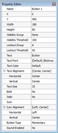
A button has the following editable properties in addition to the Basic Properties :
- Text- the text that is displayed on the button
- Text Font - the font used to display the "Text" on the button
- Text Color - the color of the "Text" displayed on the button.
- Text Alignment - the vertical and horizontal alignment of the "Text" within the button
- Text Size - the height of the "Text" (in pixels)
- Bold - when set to "Yes", applies a bold character for the Text
- Italic - when set to "Yes", applies an italic character for the Text
- Icon - an icon supplied by a theme that is placed within the button
- Icon Alignment - the alignment of the icon in relation to the button
- Button Type – determines if the button is treated as a Maintained, Momentary, or Repeating button.
- Sound Enabled - defaults to "No", but when enabled "Yes", plays the sound associated to the skin for the Theme. If the theme does not include a sound property, no sound will play for specified actions even if the "Sound Enabled" property is enabled.
Note: Setting the "Button Type" property to "Maintained" causes the button to stay depressed or pushed (down) on the first press. The second press restores the button to the normal button (Up) state. This allows the button to mimic a physical maintained switch and requires special attention when applying functionality using LightDesigner.