Configuring Direct Selects
The appearance of direct selects onscreen is highly customizable.
Direct Selects Configuration Menu
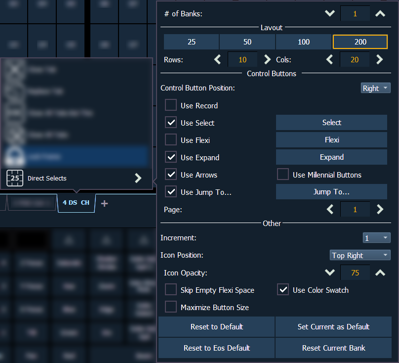
The primary way to configure direct selects is via the direct selects configuration menu. To access the menu, right-click or tap on the direct selects tab, or use the gear icon on the left of the tab bar.

The following options are available:
- # of Banks - sets the number of direct select banks that will display in the tab.
If multiple banks are selected, a drop-down menu will appear, allowing you to apply all of the additional configuration options below to a specific bank, or all open banks. Asterisks next to any of the additional configuration options indicate functions that are only enabled for specific banks.
Layout
This section allows you to configure the layout of the direct selects grid.
Note: If the frame or window is resized, the direct selects grid layout will responsively change size to fit onscreen.
- {25} / {50} / {100} / {200} - quick-select options to easily set the grid size.
- Rows - allows you to select the number of rows in the banks.
- Columns - allows you to select the number of columns in the banks.
Control Buttons
This section allows you to configure which optional control buttons will appear alongside the direct selects grid. The checkboxes on the left toggle whether a button appears in the grid. The buttons that appear on the right allow you to use that function directly from the configuration menu without having to add the button alongside the direct selects grid.
- Control Button Position - allows you to set the control buttons to display on the left or right side of the banks.
- Use Record - displays the {Record} button, which posts Record to the command line.
- Use Select - displays the {Select} button, which will display the selected direct select type. Pressing it will allow you to select a different direct select type.
- Use Flexi - displays the {Flexi} button. See Using Flexi Mode
- Use Expand - displays the {Expand} button, which will temporarily cover all other banks with the expanded target.
- Use Arrows - displays the page up and down arrows.
- Use Millennium Buttons - displays the century and millennium buttons. These buttons allow you to jump to pages in the hundreds and thousands.
- Use Jump To... - displays the {Jump To} button, allowing you to jump to specific target numbers.
- Page - allows you to jump to a specific page of direct selects.
Other
- Increment - all recorded targets will display in numerical order, including those containing decimals. Increment sets the target granularity of the grid, allowing blank decimal targets to be shown between whole-number targets.
- Icon Position - configures the location of the icon on the direct select tile. Centered will apply the icon to the entire tile. See Icons for more information about assigning icons.
- Icon Opacity - configures the opacity of the icon from 0-100. 75 is the default. Lower opacities may allow the direct select label to be more visible in front of the icon.
- Skip Empty Flexi Space - removes the empty space between a range of nonsequential target buttons when in flexi mode.
- Use Color Swatch - displays a triangular color swatch in the lower left corner of a direct select. Color swatches are available for color palettes, macros, and snapshots only.
- Maximize Button Size - sets the size of the direct select buttons to fill the available space.
- {Reset to Default} - will restore the settings to the default state. If no default state has been set, the Eos default settings will be used.
- {Set Current as Default} - allows you to set the current settings to be used as a default state when opening additional direct select tabs.
- {Reset to Eos Default} - restores the settings to Eos defaults.
- {Reset Current Bank} - restores the settings of the currently-selected bank only.
Using Flexi Mode
Direct selects can be placed into a flexi mode. {Use Flexi} needs to be enabled in the direct selects configuration menu. Once enabled, the {Flexi} button will display alongside the direct selects grid. This mode removes most of the empty buttons from the grid, but leaves a single blank tile between ranges. {Skip Empty Flexi Space} will remove this blank tile.
When in flexi mode, the {Flexi} button will be outlined in gold.

