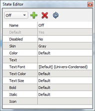
States are used to graphically represent the status of objects, such as the status of a preset a button controls. A state's purpose is to make the control visibly different than another state. The State Editor allows you to add, remove, and configure the states for a selected control(s) including some parent objects.
Each control and some parent objects can have up to 256 states. A state can be used to override certain general properties such as color and text options. Each state of a control in ControlDesigner is used as an indicator state when assigning control functionality in LightDesigner.
When selecting one or more controls of the same type (see Controls), the available state editor down menu populate with the states that are available for the selected control(s). Selecting a state from the state picker displays the properties of the selected state.
Selecting a state for the control renders the control with the state in the Page workspace. If any of the selected control(s) do not define the current state, those controls will be rendered in their default state (see Default state) and will become partially transparent. Deselecting a control will return it to its default state and opacity.
An object may have several states by default. These default states can include:
For more information on creating default button states please reference the ThemeDesigner online help.
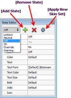
To add a new state to a control or parent object:
 located in the State Editor. A new state will be created and be made available in the State Editor drop down box.
To remove a state form a control or parent object:
 located in the State Editor. The state will no longer be available in the State Editor for that control or object and the control state will default to the default state if there is a defined default state for that control in the theme.
You can apply a new skin set to a selected control or parent object when more than one skin set is available in the theme.
 . The "Apply Skin Set" dialog displays for selection of the new skin set.
 Related Topics