Open topic with navigation
State Properties
Like parent objects and controls, a state has several editable properties that define it’s functions and graphic look.
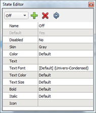
Editable properties include:
- Name - the name of the state which also displays in the state drop down box.
- Default – sets the current state as the default state for the selected control / parent object
- Disabled – sets the current state to be used only when a control is locked out
- Skin - the skin from the "Theme" that is used to render the control for the current state
- Color - the background color of the control, rendered behind the selected skin
- Some skins define a mask that is used to define the area of the background that is replaced with this color. If no mask is defined, the bounding box of the control is replaced with the chosen color. Press the [Return to Default] icon
 to set the color back to its default.
- Text - text that will override any text set in the control's properties when the control is in this state.
- Text Font - a font that will override the text font set in the control's properties when the control is in this state
- Text Color - a color that will override the text color set in the control's properties when the control is in this state
- Text Size - a color that will override the text size set in the control's properties when the control is in this state
- Bold - the character format available that will override the character format set in the control's properties when the control is in this state
- Italic - a character format available that will override the character format set in the control's properties when the control is in this state
- Icon - an icon that will override the icon set in the control's properties when the control is in this state
The "Text", "Text Font", "Text Color", "Text Size", "Bold", "Italic", and "Icon" properties are only displayed for control and object types that have a Text property (i.e. button, label and tab).
Default state
The default state is the state that displays by default when no indicator or state functions are designated in the Paradigm LightDesigner configuration for a control attribute. An object or control may have only one default state. A parent object or control that is drawn in ControlDesigner displays with the default state.
Disabled State
The disabled state is the state that a control attribute will use when a control or object is disabled in a configuration (see Hiding and Disabling Controls). Each control or object may only have one disabled state.
Changing Skins of a State
Each control or object has a number of skins available as configured in the theme when you began creating the new configuration. Each state uses a skin for the included control attribute.
To change the skin assigned to a state:
- Select the control to modify.
- Select the state to modify from the available states in the State Editor drop down list or select the [Add State] icon
 to create a new state.
- If a new state is added, reference State Editor for instructions to complete the new states properties.
- Within the State Editor, select the "Skin" property and choose the skin to associate to the state.
- To specify a skin that is not currently located in the ControlDesigner library, select the [Browse Folders] icon
 to locate the desired (*.png, *.xpm, *.jpg, or *.gif) graphic file.
 Related Topics