Control Properties
Each control, when selected, has a set of properties that are available for edit in the Property Editor. If multiple controls are selected, and are all of the same type, the Property Editor will display all properties of those controls for editing at once. If more than one type of control is selected, only the shared control properties can be edited.
Aside from the Basic Properties that are available for all controls, the following provides details to configure properties that are specific to a controls functions.
The "Text" property is provided when text can be displayed directly on a control, such as a button or a label.
Note: Multiple lines of "Text" can be created for the control by pressing (Shift) + (Enter) while entering text in the Property Editor. After committing the text, the line return will be represented in the property field with a "\n" character.
Text Priority between LightDesigner and ControlDesigner
Setting "Text" for a control in ControlDesigner will override any text associated to the same object within the LightDesigner configuration. The priority hierarchy for what text is displayed between the two pieces of software is:
- Text entered as part of a specific "State" in ControlDesigner, is the highest priority.
- Text entered as a property in the Property Editor of ControlDesigner
- Text entered as "Label" in LightDesigner
- No text manually entered in either application will yield a default automatic label when functionality is assigned within LightDesigner. This is the lowest priority.
The control can be re-sized to fit the specified text. This method of resizing the control to the text is successful for single line text only. Multiple lines of text on a control must be manually re-sized.
- To change the size of the control, right-click on the control.
- Select "Fit to Text" from the context menu.
Setting "Text" for a control in ControlDesigner will override any text associated to the same object within the LightDesigner configuration. The priority hierarchy for what text is displayed between the two pieces of software is:
- Text entered as part of a specific "State" in ControlDesigner, is the highest priority.
- Text entered as a property in the Property Editor of ControlDesigner
- Text entered as "Label" in LightDesigner
- No text manually entered in either application will yield a default automatic label when functionality is assigned within LightDesigner. This is the lowest priority.
Change the font of any displayed text for a selected control to any installed font on the computer that is running ControlDesigner.
- To select a font that is different from the default select the "Text Font" field in the Property Editor.
- Using the drop down menu select the desired font.
Clicking the [Reset to Default] button ![]() located in the "Text Font" field will return the font to its default setting.
located in the "Text Font" field will return the font to its default setting.
Note: ControlDesigner includes several standard fonts for use for text and labels. Additionally any font resident on the user’s computer will be available for selection. If the ControlDesigner configuration file is loaded onto another computer that does not have the selected font installed, the control will return to the default font setting.
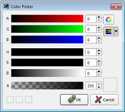
Change the color of any displayed text for a selected control utilizing the Color Picker.
- To change the color of the selected controls text from the default setting, select the "Text Color" field and press the [Display More] button
 . The color picker will display.
- Set the desired color using the Red, Green, Blue and Hue Saturation sliders, and click [OK].
Clicking the [Reset to Default] button ![]() located in the "Text Color" field will return the color to its default setting.
located in the "Text Color" field will return the color to its default setting.
Change where the text aligns on the control using the "Text Alignment" property.
- Click the expand button "+" next to the "Text Alignment" property to display the Horizontal and Vertical settings.

- Select the "Horizontal" field and choose either "Center", "Left" or "Right" from the drop down menu.
- Select the "Vertical" field and choose either "Bottom", "Center" or Top" from the drop down menu.
The selection displays in the "Text Alignment" property for easy viewing (for example [Center, Center]).
Change the size of the text as it is displayed on the control using the "Text Size" property.
- To change the size of the text displayed on the selected control, click the "Text Size" property. The field changes to display the current text size with [Up] and [Down] arrows to increase and decrease the size one pixel at a time.

- Click the [Up] or [Down] arrow to set the text height. Alternatively you may type in a numeric value.
- Commit the changes by pressing (Enter) on your alphanumeric keyboard. The text height on the control will be updated when the changes are committed.
Note: "Bold" and "Italic" options are available for Text Font of some control's. Select "Yes" from the drop down menu for the property to apply them to all text within the control as desired. These properties not affect "Label Text".
Change the icon displayed on a control using the "Icon" property.
- To change the icon that is displayed on the selected control, click the "Icon" property. The field elect the Icon field
- Using the drop down menu select the desired Icon.
Note: The icons available are determined by the theme used. Any icon available within the theme will be displayed for selection in the "Icon" property. Icons can be added if required by adding them to a custom theme of your own.
Clicking the [Reset to Default] button ![]() located in the "Icon" field will return the icon to its default setting.
located in the "Icon" field will return the icon to its default setting.
Change where the icon aligns on the control using the "Icon Alignment" property.
- Click the expand button "+" next to the "Icon Alignment" property to display the Horizontal and Vertical settings.

- Select the "Horizontal" field and choose either "Left", "Center", or "Right" from the drop down menu.
- Select the "Vertical" field and choose either "Bottom", "Center", or "Top" from the drop down menu.
Note: If the text and icons overlap each other, the text will be displayed on top.
Determines what style of control the button offers:
- To change the toggle property for the selected button, click the "Button Type" property.
- Select "Momentary", "Maintained", or "Repeating".
- Commit the changes by pressing (Enter) on your alphanumeric keyboard.
Change the format of a digital level indicator, label, or a clock using the "Format" property.
Format Digital Level Indicator
The digital level indicator control displays levels in "Percent" by default. Use the "Format" property drop down menu to display the "Raw" 0-255 level data instead.
Format Clock
The digital clock control displays in "24 Hour" format by default. Use the "Format" property drop down menu to display the "12 Hour" data instead.
Format Label
A label control displays "Text" by default. Use the "Format" property drop down menu to display the current "Date" or current "Time" instead.
Specify any text to display as a label beneath faders and level indicator controls.
- To add a label for the selected fader or level indicator control, click the "Label" property and type the label desired.
- Commit the label by pressing (Enter) on your alphanumeric keyboard or click outside of the label property.
Label Priority between LightDesigner and ControlDesigner
Specifying a label for a control in ControlDesigner will override any text associated to the same object within the LightDesigner configuration. The priority hierarchy for what label is displayed between the two pieces of software is:
- Label entered as part of a specific State in ControlDesigner, is the highest priority.
- Label entered as a property in the Property Editor of ControlDesigner
- Label entered as "Label" in LightDesigner
- No label manually entered in either application will yield a default automatic label when functionality is assigned within LightDesigner. This is the lowest priority.
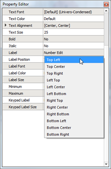
Change the position of the label. By default, the label is positioned centered beneath the control.
- To change the label position for the selected control, click the "Label Position" property.
- Select desired position from the list available in the drop down menu.

- Commit the change by pressing (Enter) on your alphanumeric keyboard or clicking outside of the "Label Position" property.
Change the font of any displayed label for a selected control to any installed font on the computer that is running ControlDesigner.
By default, the label uses "Univers-Condensed" font which is supplied with the ControlDesigner application.
- To select a font that is different from the default select the "Label Font" field in the Property Editor.
- Using the drop down menu select the desired font.
Clicking the [Reset to Default] button ![]() located in the "Label Font" field will return the font to its default setting.
located in the "Label Font" field will return the font to its default setting.
Note: ControlDesigner includes several standard fonts for use for text and labels. Additionally any font resident on the user’s computer will be available for selection. If the ControlDesigner configuration file loaded onto another computer that does not have the selected font installed, the control will return to the default font setting.
Change the color of any displayed label for a selected control utilizing the Color Picker.
- To change the color of the selected controls label from the default setting, select the "Label Color" field and press the [Display More] button
 . The color picker will display.
- Set the desired color using the Red, Green, Blue and Hue Saturation sliders, and click [OK].
Clicking the [Reset to Default] button ![]() located in the "Label Color" field will return the color to its default setting.
located in the "Label Color" field will return the color to its default setting.
Change the size of the text on the label as it is displayed on the control using the "Label Size" property.
- To change the size of the label text displayed on the selected control, click the "Label Size" property. The field changes to display the current text size with [Up] and [Down] arrows to increase and decrease the size one pixel at a time.

- Click the [Up] or [Down] arrow to set the label text height. Alternatively you may type in a numeric value.
- Commit the changes by pressing (Enter) on your alphanumeric keyboard. The label text height on the control will be updated when the changes are committed.
Controls such as a fader and the linear level indicator can be oriented vertically or horizontally. You can change the orientation of the control even after the control has been drawn on the Page workspace.
- To change the orientation of the selected control, click the "Orientation" property.
- Select either "Horizontal" or "Vertical" from the drop down menu.
- Commit the changes by pressing (Enter) on your alphanumeric keyboard or click outside of the property field.
Fader controls are provided with properties which specify how long the fader waits to begin subsequent level changes when a fader increment or decrement button pushed and held. By default this is set to 500 ms. Use the "Repeat Timeout" property to change the value from the default. This property also relates to the Repeat Speed property.
- To change the timeout value of the selected fader control, click the "Repeat Timeout" property. The field changes to display the current value with [Up] and [Down] arrows to increase and decrease the time in microseconds.
- Click the [Up] or [Down] arrow to increment or decrement the value. Alternatively you may type in a numeric value.
- Commit the changes by pressing (Enter) on your alphanumeric keyboard or click outside of the property field.
Fader controls are provided with properties which specify the interval between level increases when a fader button is held down. By default this is set to 200 ms. Use the "Repeat Speed" property to change the value from the default. This property also relates to the Repeat Timeout property.
- To change the repeat speed of the selected fader control, click the "Repeat Speed" property. The field changes to display the current value with [Up] and [Down] arrows to increase and decrease the time in microseconds.
- Click the [Up] or [Down] arrow to increment or decrement the value. Alternatively you may type in a numeric value.
- Commit the changes by pressing (Enter) on your alphanumeric keyboard or click outside of the property field.
Clock controls are provided with the ability to display or hide seconds. Use the "Show Seconds" property to change the default setting.
- To change the display of seconds values on the selected clock control, click the "Show Seconds" property.
- Select "Yes" or "No" from the drop down menu.
- Commit the changes by pressing (Enter) on your alphanumeric keyboard or click outside of the property field.
Fader controls can be set to display or hide the level value of the assigned control. If set to "Yes" the level percentage value is displayed beneath the fader control, if set to "No, the value is not displayed.
- To change the display of level values on the selected fader control, click the "Show Value" property.
- Select "Yes" or "No" from the drop down menu.
- Commit the changes by pressing (Enter) on your alphanumeric keyboard or click outside of the property field.
Sound can be enabled for controls, allowing the Touchscreen to play the sound associated to the skin for the Theme. If the theme does not include a sound property, no sound will play for specified actions even if the "Sound Enabled" property is enabled.