Open topic with navigation
Button and Slider Properties
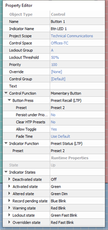
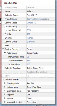
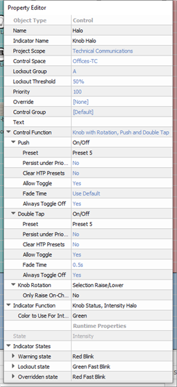
Selecting a button or slider control, either from the Browser or by selecting the control from a station in simulation, displays its properties in the Property Editor. Buttons and sliders share several common properties.
Tip: Properties that are specific to a button, slider, or knob control will be specified in the property description.
- Object Type - the type of object you have selected. This property is not selectable or editable.
- Name - the name of the control (example: Button 1)
- Indicator Name - name of the indicator (LED) for the selected control (example: Btn LED 1)
- Control Space - which space will be affected by the control or the space where the control exists within.
- Override - allows the assignment of an override to the control. Any overrides that have been created can be applied in this property.
- Lockout Group - the lockout group to which this control is associated (default is "A").
- Lockout Threshold - the threshold that must be met or exceeded which causes the control to become disabled (default is "50%").
- Priority - priority level for the action controlled. Default is 100.
- Control Group - sets which control group the button is associated, (Default is the space that the station was created within) all controls of a given station belong to this control group by default. Any control groups that have been created can be applied in this property.
- Label - text that will appear on the control. If blank the object assigned to the control function will display as the label.
- Control Function - the selected object type determines which Control Functions are allowed for the control. A series of property menus are displayed beneath the Control Function that allow user specification of the function and related action according to the function. Set the control function from the available options in the drop-down menu.
- A button provides "Maintained Button", "Momentary Button", "Momentary Dual Action Button", "Occupancy Sensor", "Occupancy Sensor with Delay", and "Repeating Button" functions.
- A Knob provides "Knob with Rotation, Push and Double Tap" control function
- A Slider provides , "Fader", "Number Edit (fraction)", "Photo Sensor Dimming", "Photo Sensor Switched", and "Tri-State Page Select"
Note: Additional properties will display to further specify the selected controls function. Properties can become very specific depending on the selections made. For best results, completely specify an action property for each of the "Control Function" sub-property selections.
- Runtime Properties - a "view only" property that displays the current “live” properties for an active control.
- State - this is a "view only" property of a button that displays the state of the control (example "Up" meaning the button is in the up state, not depressed).
- Value - this is a "view only" property of a slider that displays the value of the controls (example "0" meaning the slider is at zero intensity, and "255" meaning the slider is at full intensity. The value displayed is dependent on the properties.
- Indicator Function - sets what action or change to an object will cause the indicator or fader knob will display with a specific state change.
- Indicator States - each indicator function is defined into a number of indicator states. These are listed along with user configurable behaviors that can be used for that state.
Note: Different indicator functions will have different indicator states. Different behaviors, such as color options for stations and sensors or various touchscreen button states, may be assigned to individual indicator states which allows for customization of indicator feedback.
