Each control, when selected, has a set of properties that are available for edit in the Property Editor. If multiple controls are selected, and are all of the same type, the Property Editor will display all properties of those controls for editing at once. If more than one type of control is selected, only the shared control properties can be edited.
Aside from the Basic Properties that are available for all controls, the following provides details to configure properties that are specific to a controls functions.
The "Text" property is provided when text can be displayed directly on a control, such as a button or a label.
Setting "Text" for a control in ControlDesigner will override any text associated to the same object within the LightDesigner configuration. The priority hierarchy for what text is displayed between the two pieces of software is:
The control can be resized to fit the specified text. This method of resizing the control to the text is successful for single line text only. Multiple lines of text on a control must be manually resized.
Setting "Text" for a control in ControlDesigner will override any text associated to the same object within the LightDesigner configuration. The priority hierarchy for what text is displayed between the two pieces of software is:
Change the font of any displayed text for a selected control to any installed font on the computer that is running ControlDesigner.
Clicking the [Reset to Default] icon located in the "Text Font" field will return the font to its default setting.
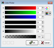
Change the color of any displayed text for a selected control utilizing the Color Picker.
Clicking the [Reset to Default] icon located in the "Text Color" field will return the color to its default setting.
Change where the text aligns on the control using the "Text Alignment" property.
The selection displays in the "Text Alignment" property for easy viewing (for example [Center, Center]).
Change the size of the text as it is displayed on the control using the "Text Size" property.
Change the icon displayed on a control using the "Icon" property.
Clicking the [Reset to Default] icon located in the "Icon" field will return the icon to its default setting.
Change where the icon aligns on the control using the "Icon Alignment" property.
Determines what style of control the button offers:
Change the format of a digital level indicator, label, or a clock using the "Format" property.
The digital level indicator control displays levels in "Percent" by default. Use the "Format" property drop down menu to display the "Raw" 0-255 level data instead.
The digital clock control displays in "24 Hour" format by default. Use the "Format" property drop down menu to display the "12 Hour" data instead.
A label control displays "Text" by default. Use the "Format" property drop down menu to display the current "Date" or current "Time" instead.
Specify any text to display as a label beneath faders and level indicator controls.
Specifying a label for a control in ControlDesigner will override any text associated to the same object within the LightDesigner configuration. The priority hierarchy for what label is displayed between the two pieces of software is:
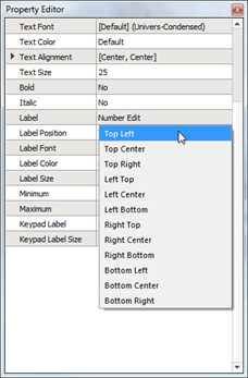
Change the position of the label. By default, the label is positioned centered beneath the control.
Change the font of any displayed label for a selected control to any installed font on the computer that is running ControlDesigner.
By default, the label uses "Univers-Condensed" font which is supplied with the ControlDesigner application.
Clicking the [Reset to Default] icon located in the "Label Font" field will return the font to its default setting.
Change the color of any displayed label for a selected control utilizing the Color Picker.
Clicking the [Reset to Default] icon located in the "Label Color" field will return the color to its default setting.
Change the size of the text on the label as it is displayed on the control using the "Label Size" property.
Controls such as a fader and the linear level indicator can be oriented vertically or horizontally. You can change the orientation of the control even after the control has been drawn on the Page workspace.
Fader controls are provided with properties which specify how long the fader waits to begin subsequent level changes when a fader increment or decrement button pushed and held. By default this is set to 500 ms. Use the "Repeat Timeout" property to change the value from the default. This property also relates to the Repeat Speed property.
Fader controls are provided with properties which specify the interval between level increases when a fader button is held down. By default this is set to 200 ms. Use the "Repeat Speed" property to change the value from the default. This property also relates to the Repeat Timeout property.
Clock controls are provided with the ability to display or hide seconds. Use the "Show Seconds" property to change the default setting.
Fader controls can be set to display or hide the level value of the assigned control. If set to "Yes" the level percentage value is displayed beneath the fader control, if set to "No, the value is not displayed.
Sound can be enabled for controls, allowing the Touchscreen to play the sound associated to the skin for the Theme. If the theme does not include a sound property, no sound will play for specified actions even if the "Sound Enabled" property is enabled.