Open topic with navigation
Button and Slider Properties
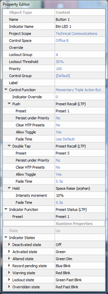
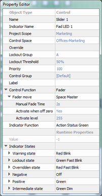
Selecting a button or slider control, either from the Browser or by selecting the control from a station in simulation, displays its properties in the Property Editor. Buttons and sliders share several common properties.


TIP: Properties that are specific to a button, slider, or knob control will be specified in the property description.
- Object Type - the type of object you have selected. This property is not selectable or editable.
- Name - the name of the control (example: Button 1)
- Indicator Name - name of the indicator (LED) for the selected control (example: Btn LED 1)
- Runtime Properties - a "view only" property that displays the current “live” properties for an active control.
- State - this is a "view only" property of a button that displays the state of the control (example "Up" meaning the button is in the up state, not depressed).
- Value - this is a "view only" property of a slider that displays the value of the controls (example "0" meaning the slider is at zero intensity, and "255" meaning the slider is at full intensity. The value displayed is dependent on the properties.
- Indicator Function - sets what action or change to an object will cause the indicator or fader knob will display with a specific state change.
- Indicator States - each indicator function is defined into a number of indicator states. These are listed along with user configurable behaviors that can be used for that state.
Different indicator functions will have different indicator states. Different behaviors, such as color options for stations and sensors or various touchscreen button states, may be assigned to individual indicator states which allows for customization of indicator feedback.
 Related Topics
